What is a Histogram?
As a part of your data analysis in a quantitative study, you may be asked to present histograms of the variables in your data. A histogram is a visual representation of a variable’s distribution. More specifically, a histogram is a plot of the frequencies of a variable’s values. In other words, a histogram shows us how often different values of a variable occur in the data. Histograms are typically depicted by a series of bars arranged along an x-axis (representing the values of the variable) with the length of the bars shown along the y-axis (representing the frequency of the values) as seen in the figure below:
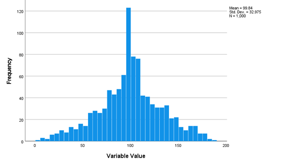

The figure above shows data that are approximately normally distributed. In a normal distribution, the most frequent values occur near the middle of the distribution, and values become less and less frequent as you move away from the middle of the distribution. In the above example, values around 100 are the most frequent. Values farther from the middle (e.g., values near 50 or 150) are less frequent than values near 100. And values even farther from the middle (e.g., near 0 or 200) are even less frequent to the point which these values almost never show up in the data. As we see in the example above, the histogram is a useful visualization of the data that allows us to confirm that the data are normally distributed.
Similarly, histograms can reveal if data are not normally distributed. Below are some examples of histograms displaying non-normal data:
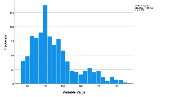
The figure above shows data that are positively skewed (i.e., skewed to the right), meaning that values near the left side of the distribution (lower values) occur more frequently than values near the right side of the distribution (higher values).
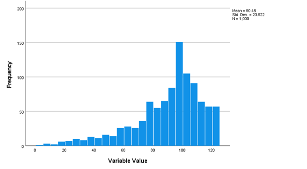
This next figure seen above shows data that are negatively skewed (i.e., skewed to the left). In a negatively skewed distribution, values near the right side of the distribution (higher values) occur more frequently than values near the left side of the distribution (lower values).
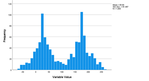
The last example (shown above) is a bimodal distribution, meaning that there are two “peaks” in the distribution where values most frequently occur. In this example, values near 25 and 175 show up most frequently in the data.
Histograms, therefore, can not only help identify if the data are normal or non-normal, but they can also show us the precise shape of the distribution. Knowing the exact shape of the distribution can help you determine the best ways to handle and analyze the data.